Acton Elementary
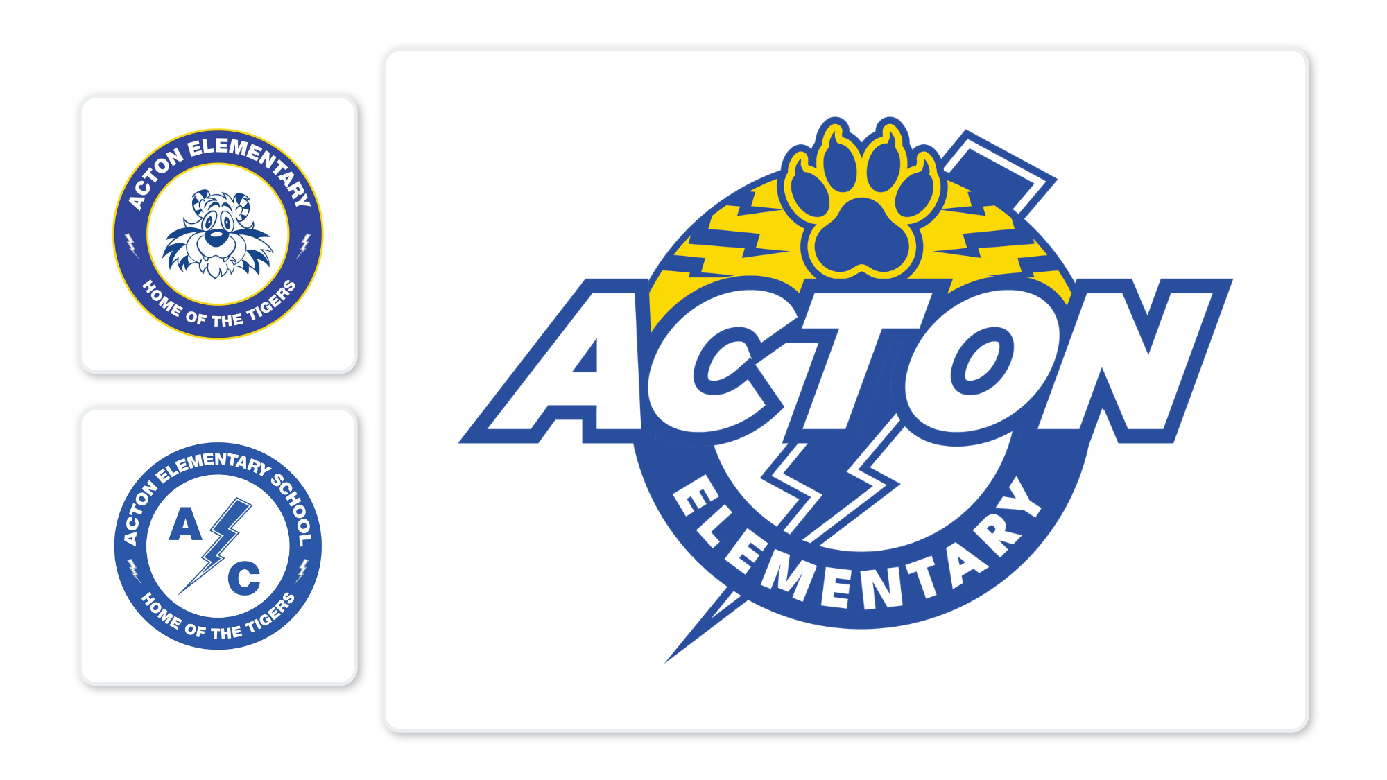
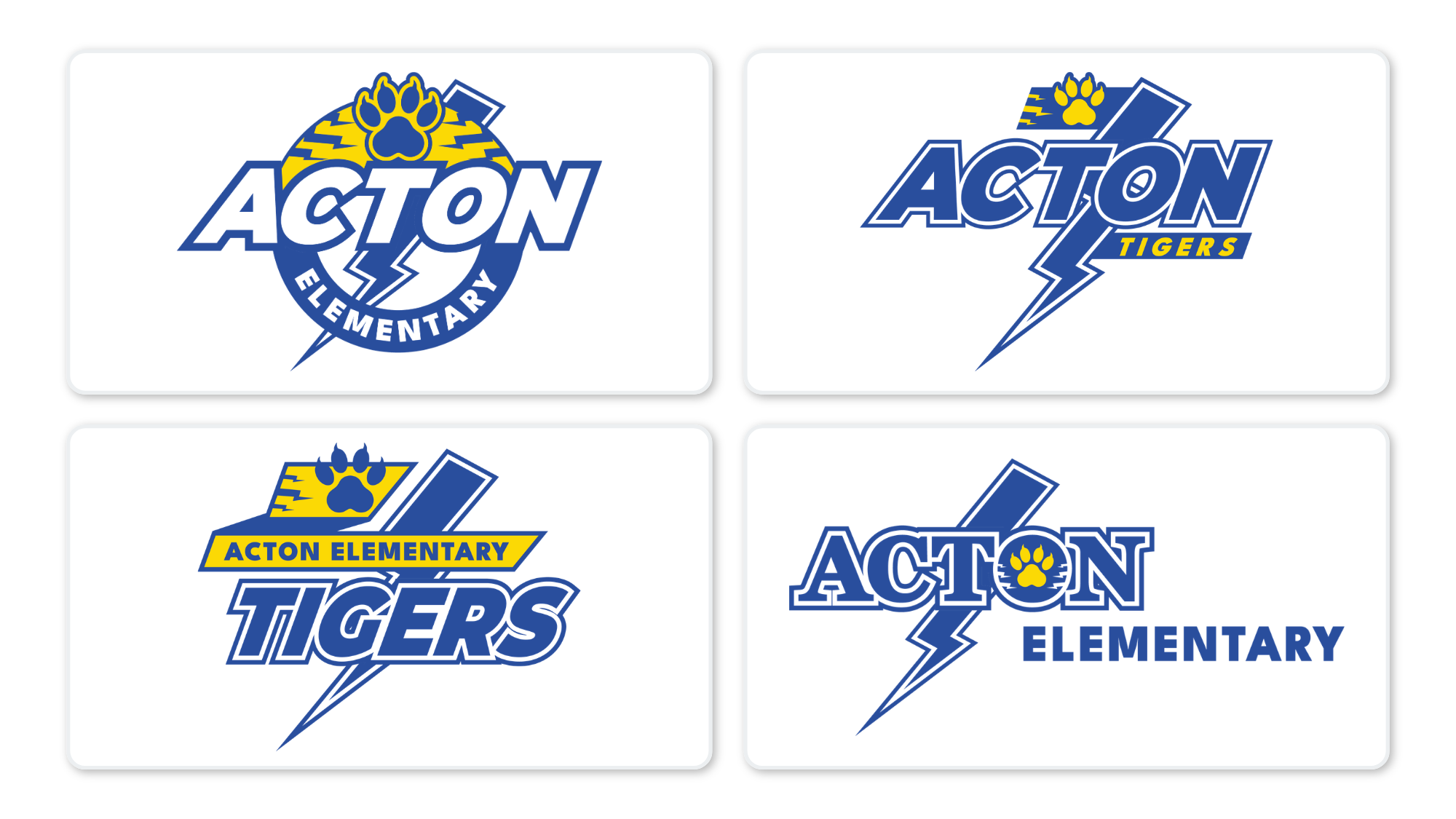
Building one district identity without erasing the school identities inside it.
Franklin Township had a clear idea of who they were: one community, one high school, one shared identity as the Flashes.
Their visual identity needed to tell the same story.
The district's existing seal had little relationship to the Flashes identity used throughout the community. An earlier attempt to create consistency across elementary schools had introduced the lightning bolt everywhere, but in doing so had minimized the mascots, colors, and traditions individual school communities cared about.
The challenge became bigger than designing a new district logo. I needed to build a visual system where every school could feel unmistakably Franklin Township and unmistakably itself.
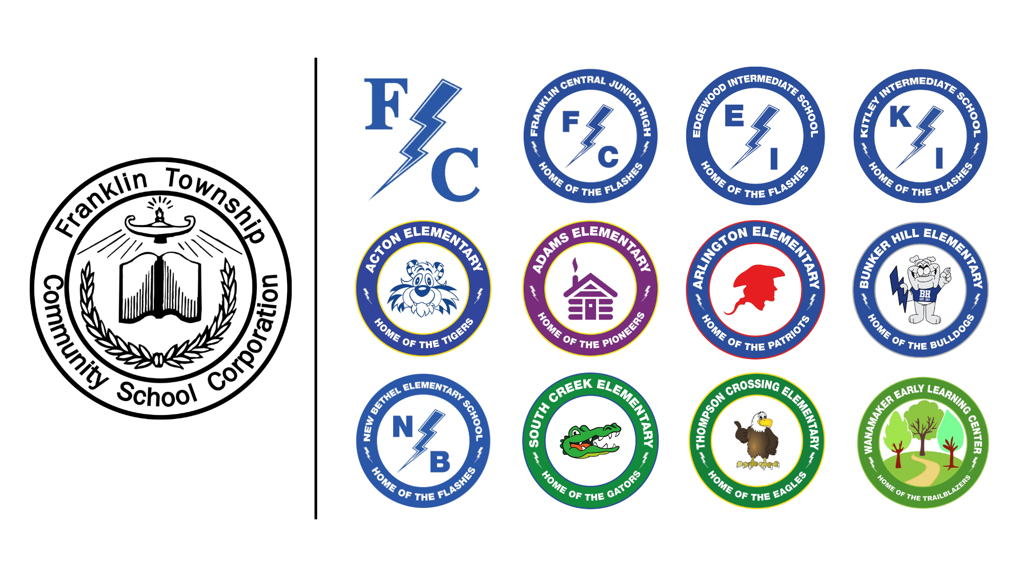
Franklin Township's schools all feed into one high school. Students may begin as Tigers, Gators, Bulldogs, Eagles, or Patriots, but eventually they all become Flashes.
That gave the district something really unique to build from.
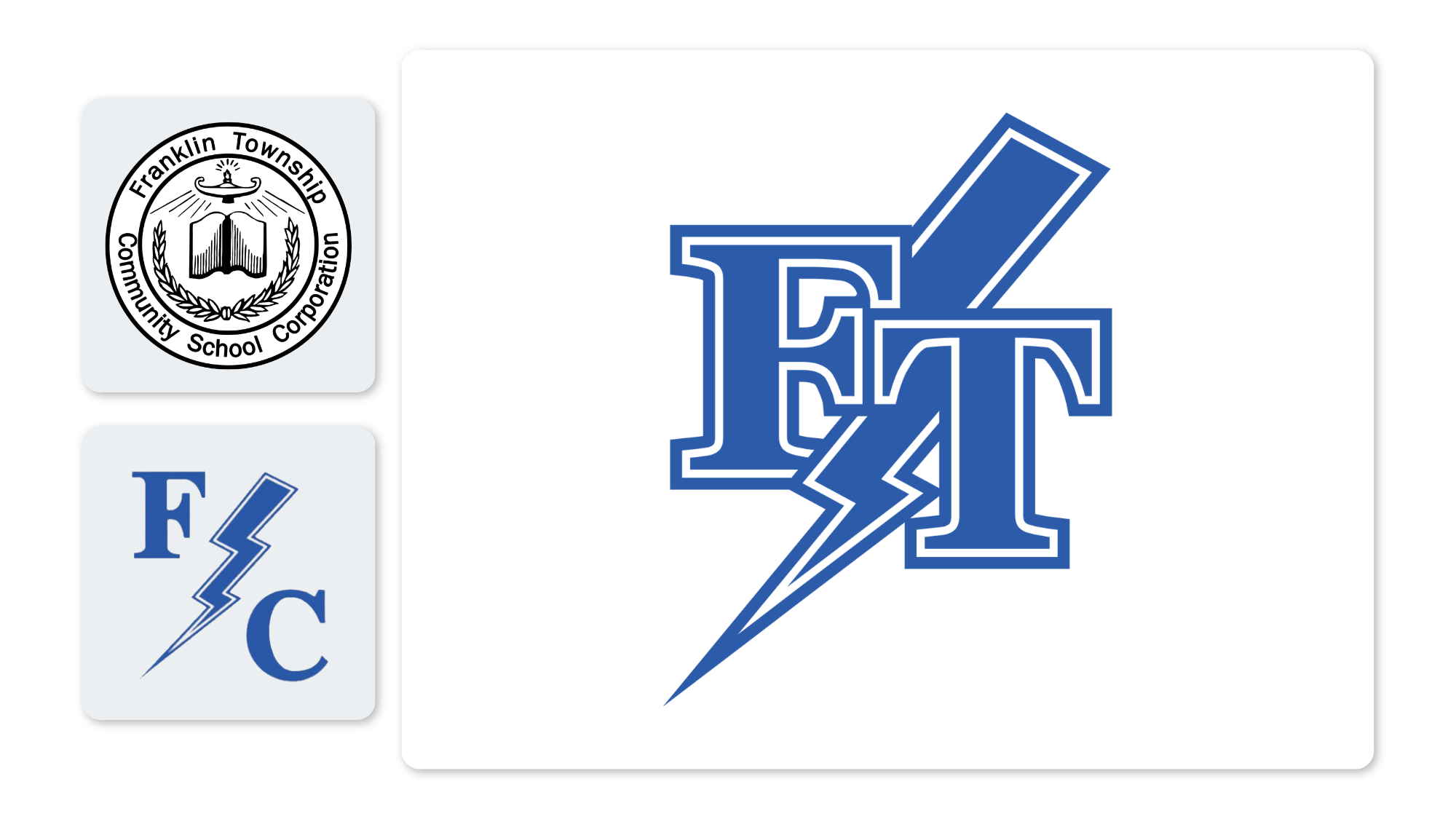
The starting point was already clear. Franklin Central's FC monogram and lightning bolt had become the visual the district used and recognized far more often than its existing seal. I took that familiar language and developed it into an identity system that could represent the entire district.
I refined the geometry, tightened the letterforms, cleaned up the bolt, and used that same visual language to create a new FT monogram for the district.
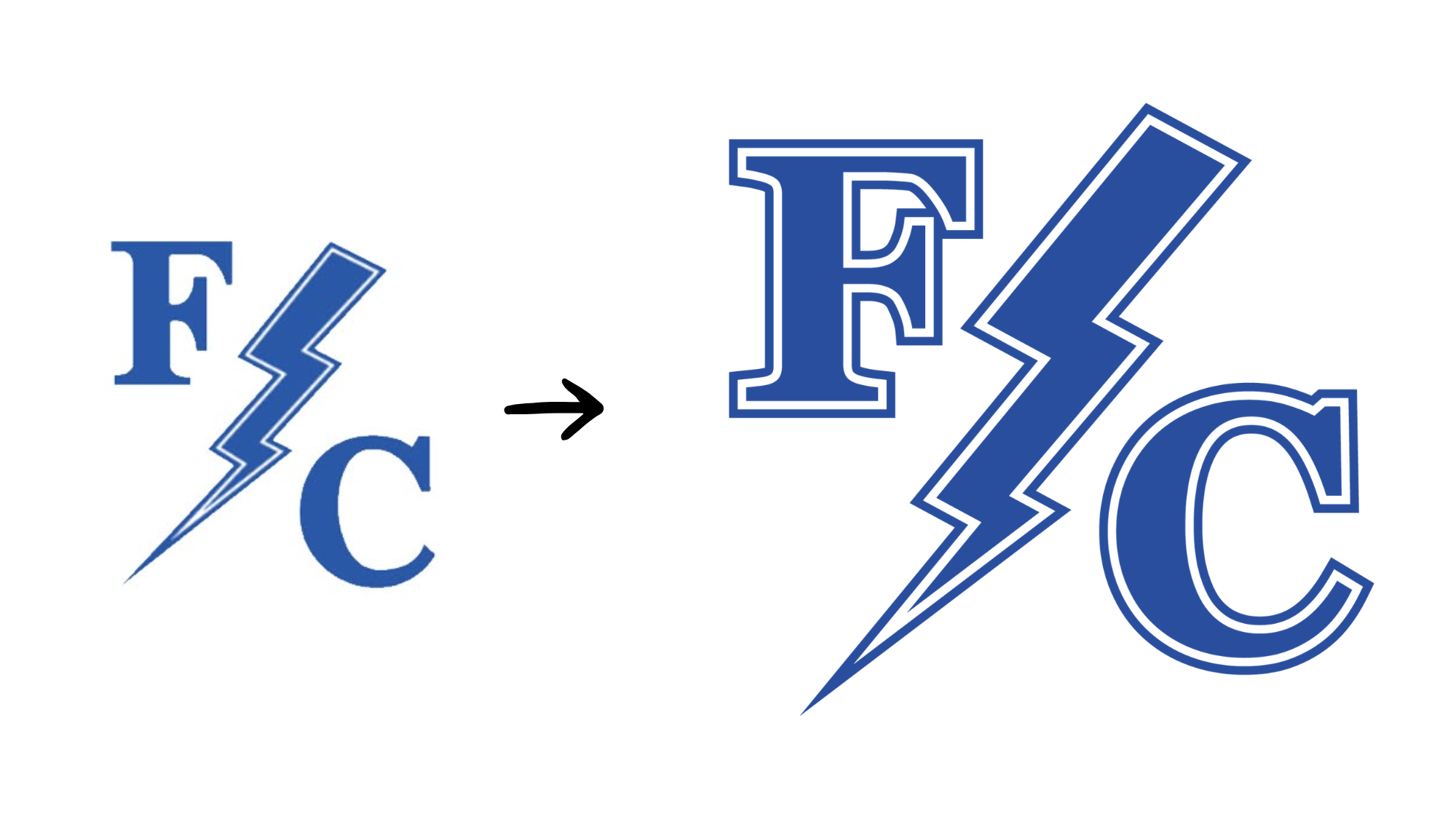
The result connected the district to the identity already living throughout its community instead of asking everyone to learn a new one.
Consistency had been attempted before by giving elementary schools versions of the same blue lightning-bolt identity.
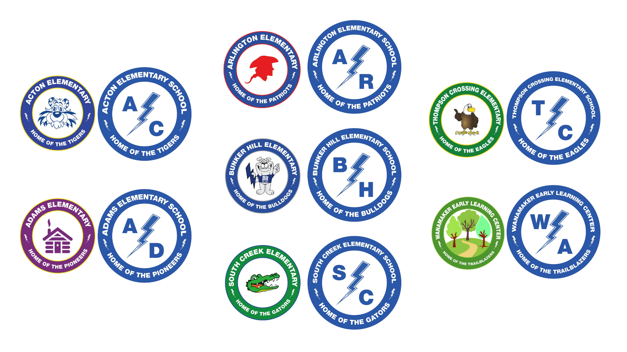
It solved one problem and created another.
A Tiger wasn't really a Tiger anymore. A Gator wasn't a Gator. Schools became more consistent with one another, but less recognizable as themselves.
So I established a different set of rules:
Flash Blue would belong to everyone.
The lightning bolt would connect everyone.
The mascot would remain the hero.
Each school's legacy color became an accent rather than a competing identity. Typography, composition, lockups, and logo families followed the same structure across the district.
The schools could finally look related without looking identical.
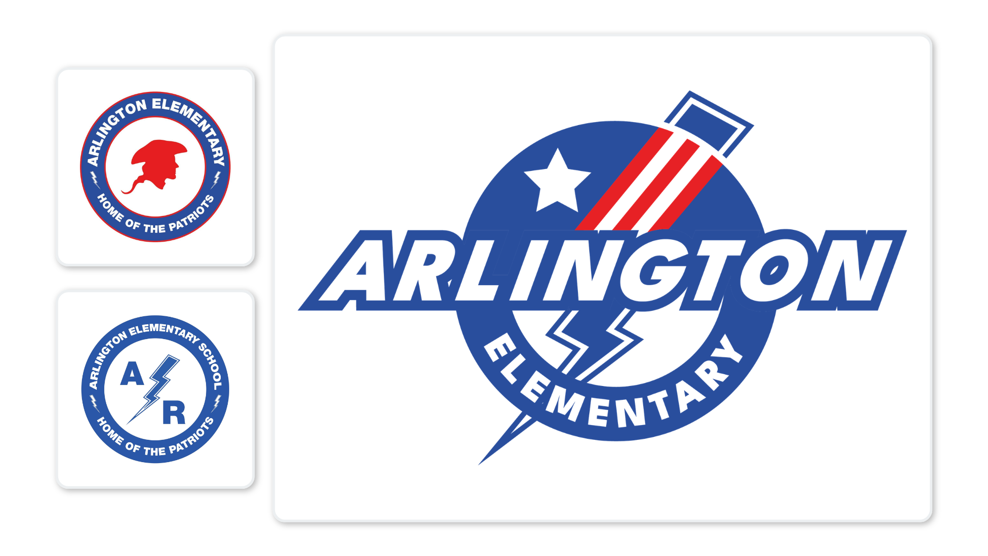
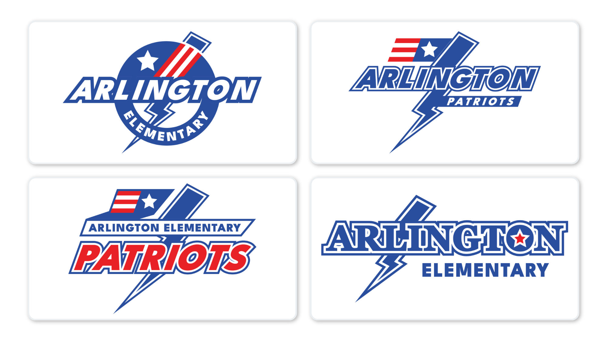
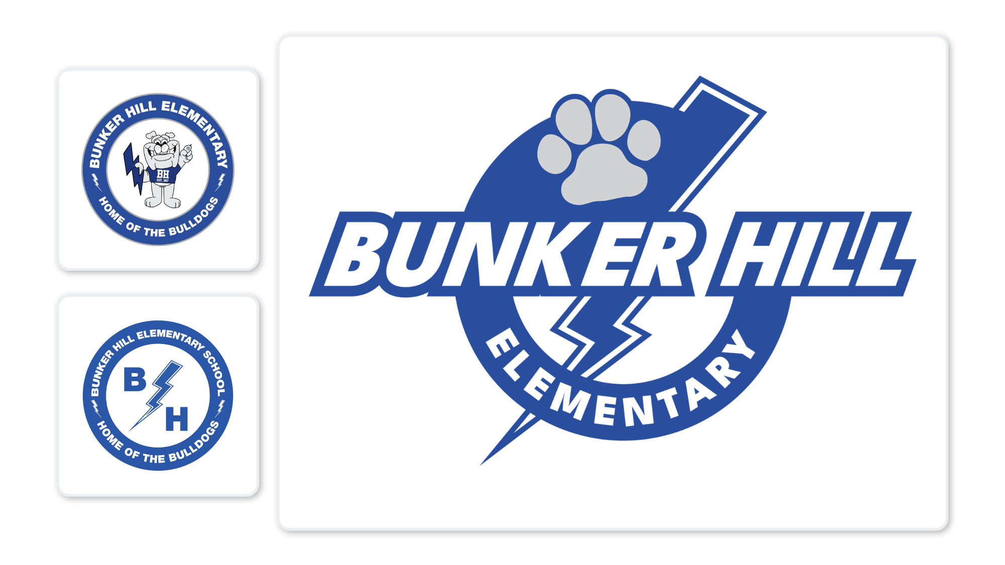
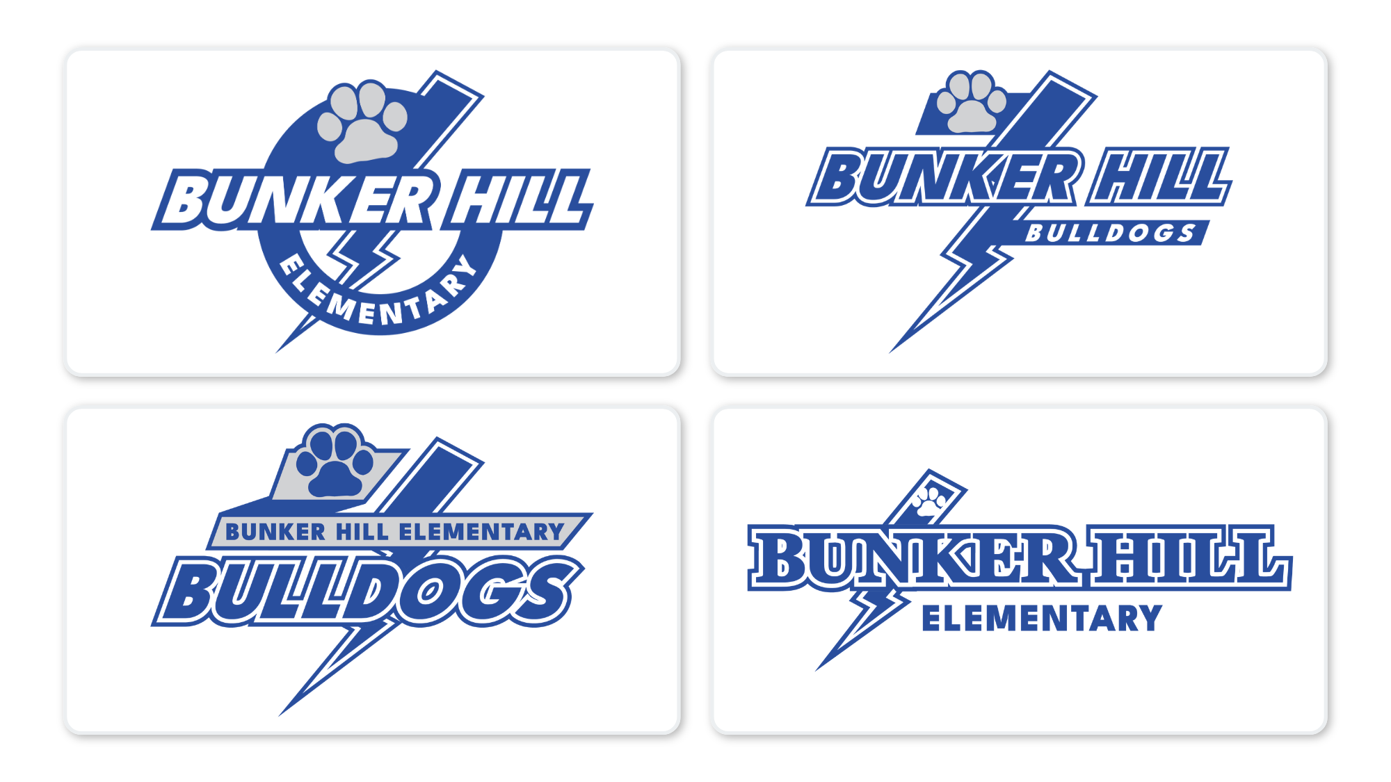
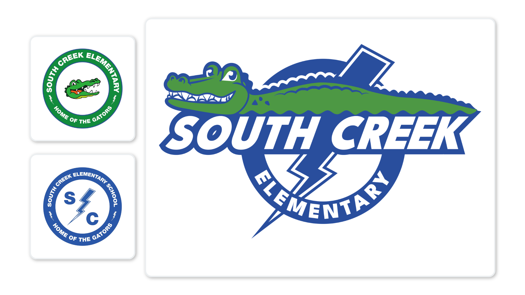
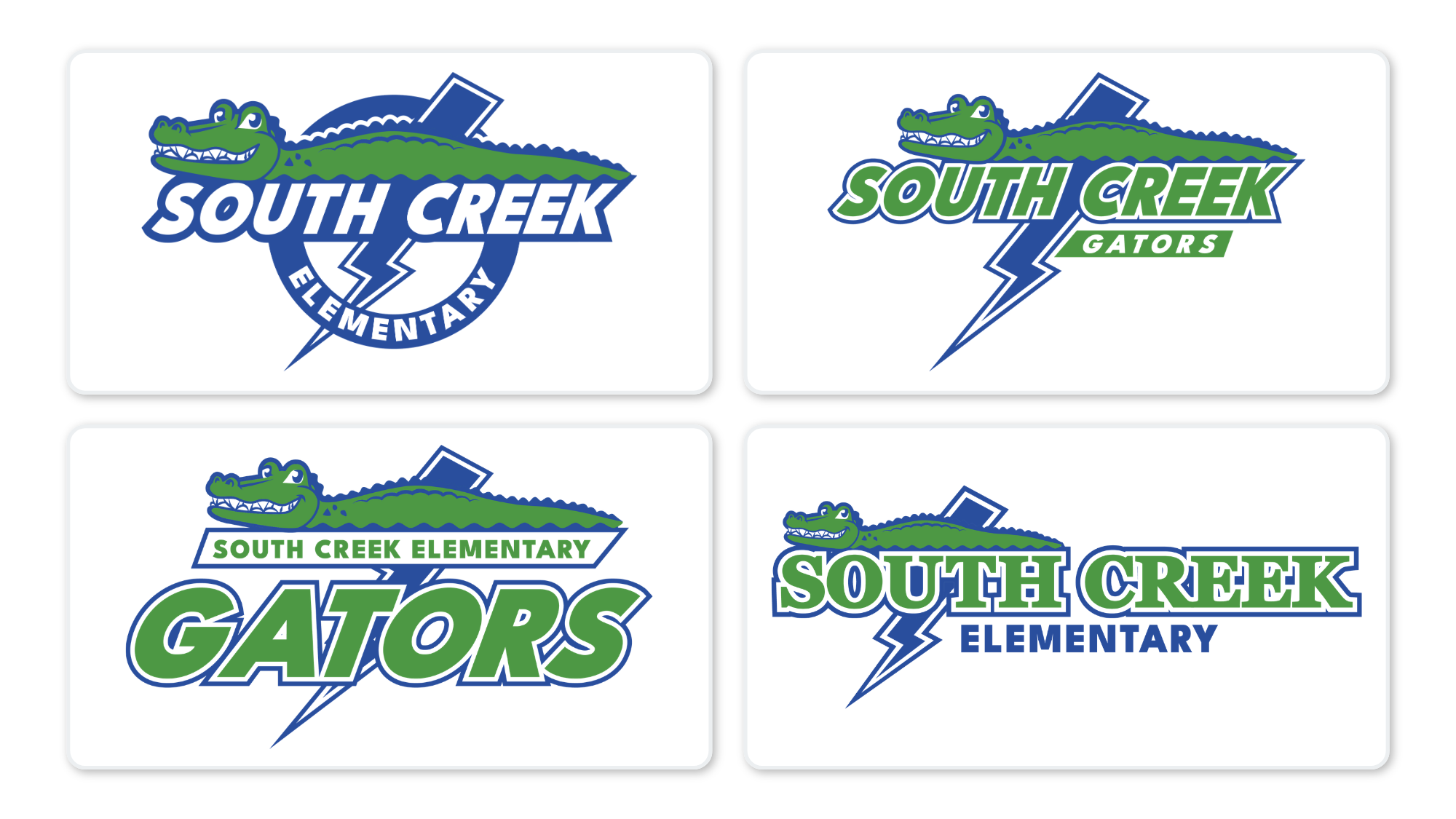
South Creek is a good example of the system doing exactly what it was supposed to do.
Previously, the school's gator identity and its blue district identity effectively lived as separate brands. The new system brought them together. Flash Blue became the shared foundation, Gator Green remained an identifying accent, and the mascot came back to the center of the school's visual identity.
A cohesive identity only works if people can actually use it.
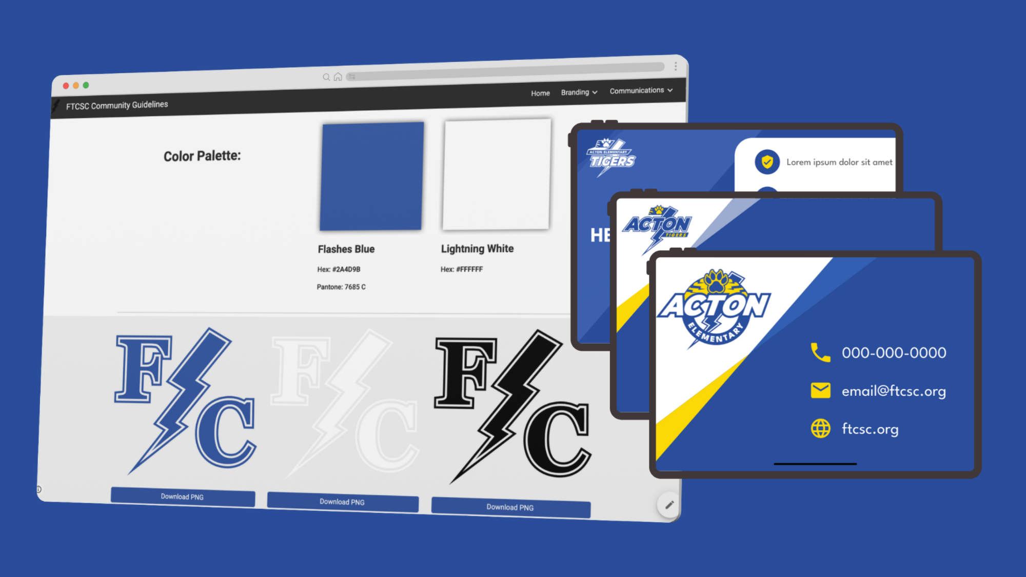
I created the district's complete brand guide and an online brand hub where educators and administrators could find their school, reference approved colors, and download the correct logo for whatever they were creating.
The guide covered primary and secondary logo families, horizontal and circular configurations, typography, colors, small-space marks, and misuse guidance.
Instead of asking hundreds of staff members to interpret the brand system themselves, the system made the right choice easy.
This is probably my favorite project I've worked on.
I started this project shortly after my husband and I moved back home after a decade away, and we moved in literally around the corner from the high school we both graduated from. Coming home reminded me how much identity can be tied to a school and a community.
A school logo lives on shirts and gym walls and graduation photos. Kids draw it. Families wear it. Alumni still identify with it decades later.
Years of belonging somewhere matters. The mascot you cheered for, the colors you wore, the logo on the front of your sweatshirt all become part of how you remember that time and that version of yourself.
These weren't just logos I was cleaning up. They belonged to people's hearts already. My job was to make them stronger without designing away everything that made them theirs.